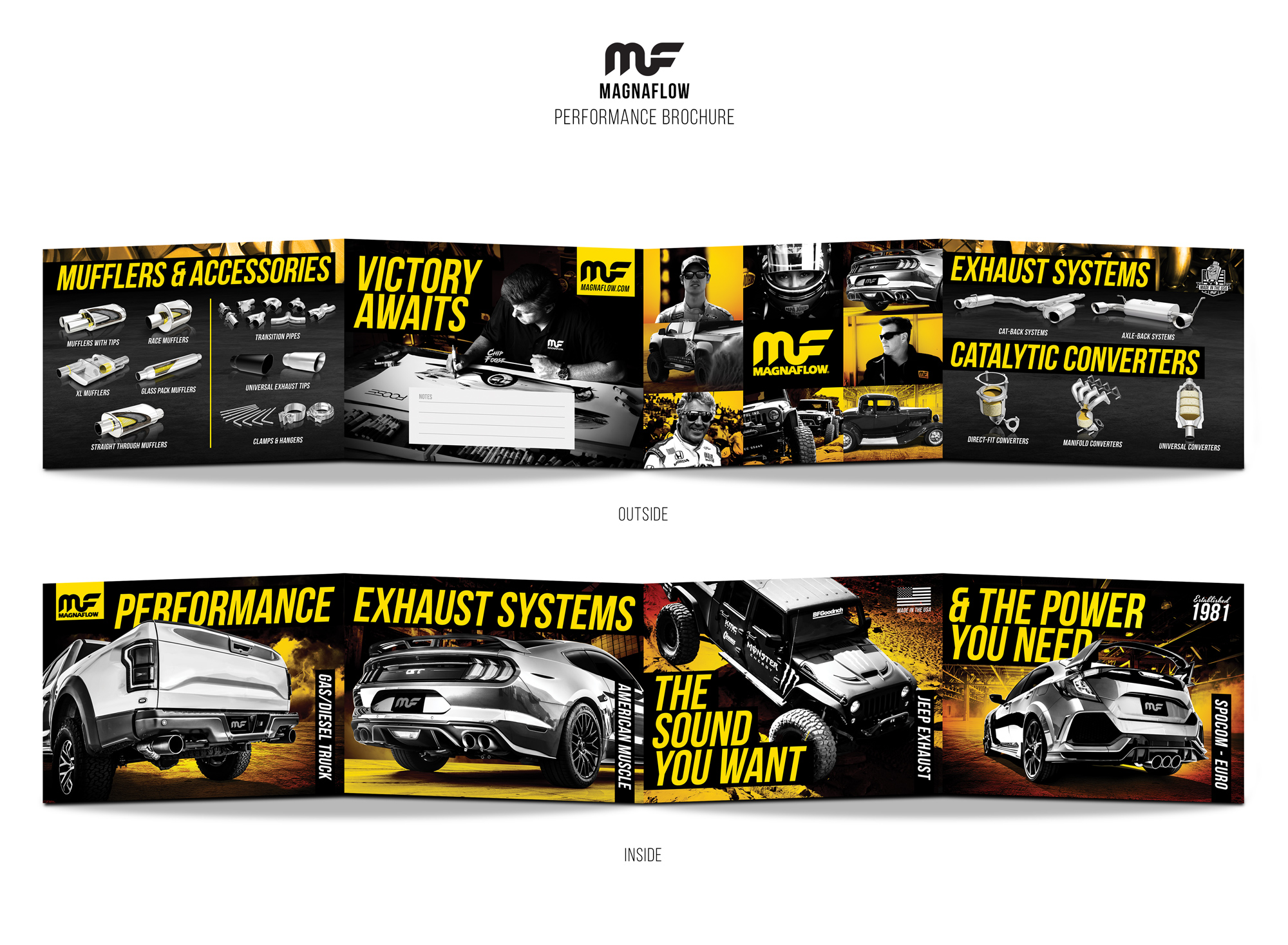
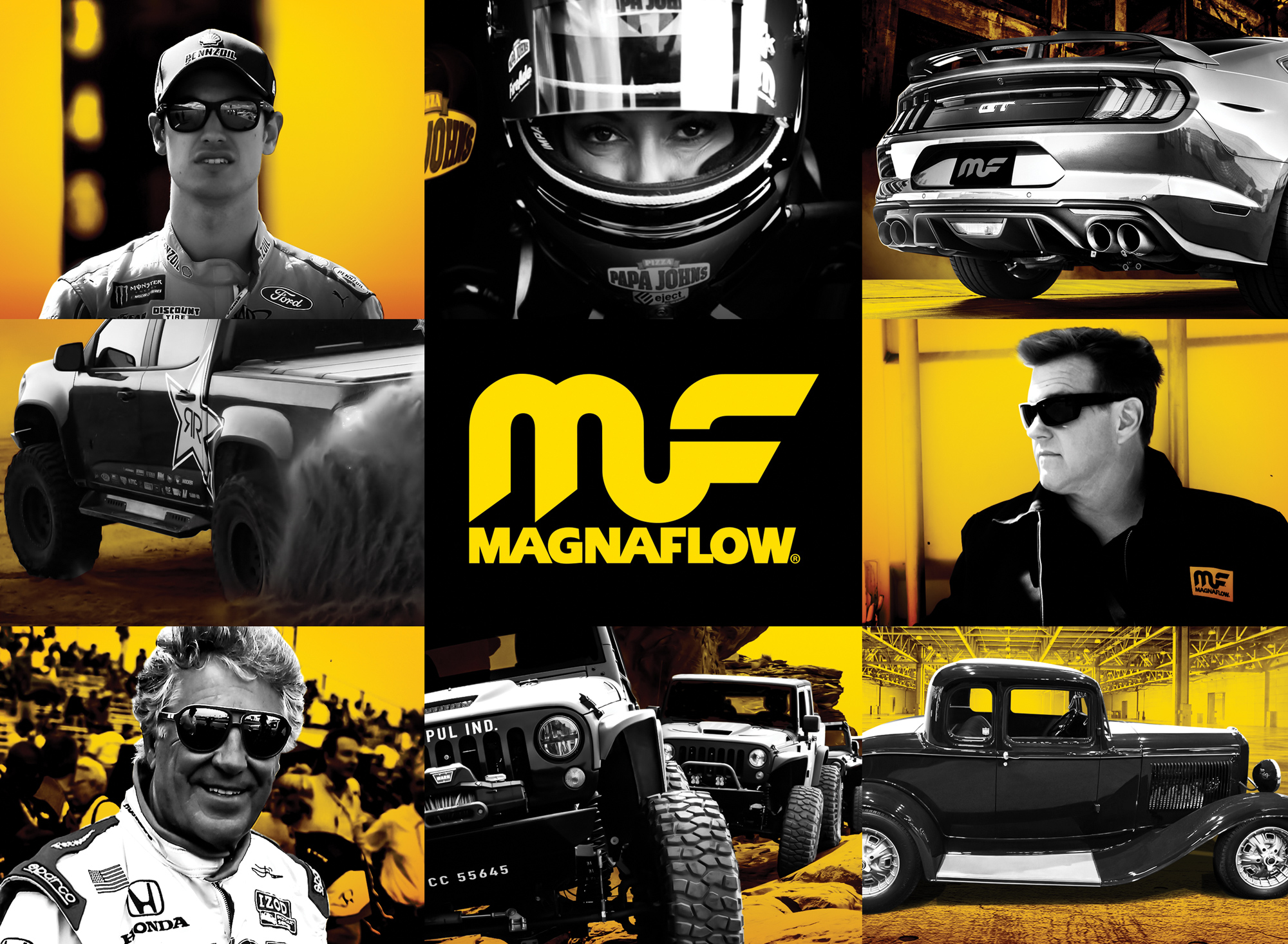
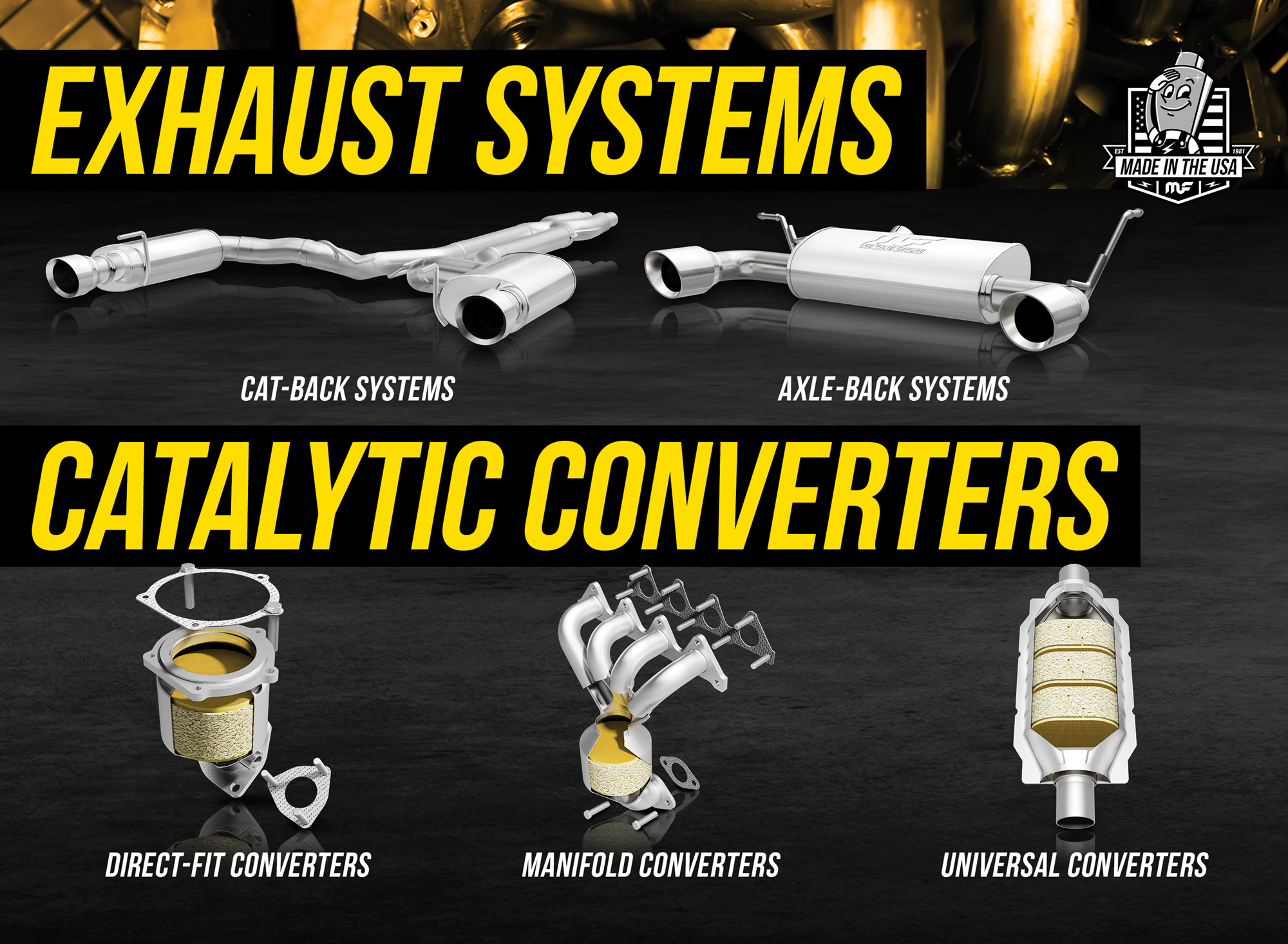
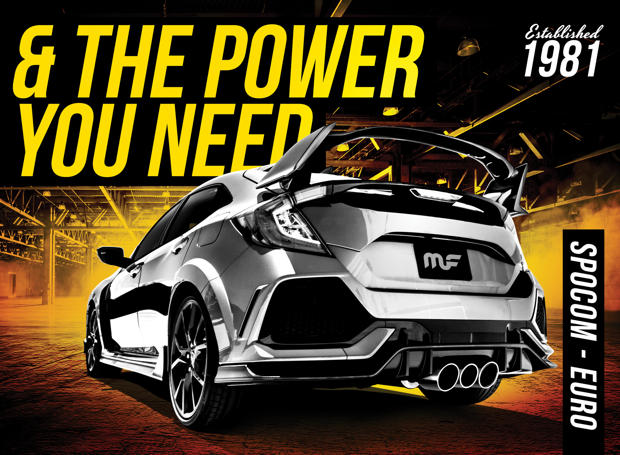
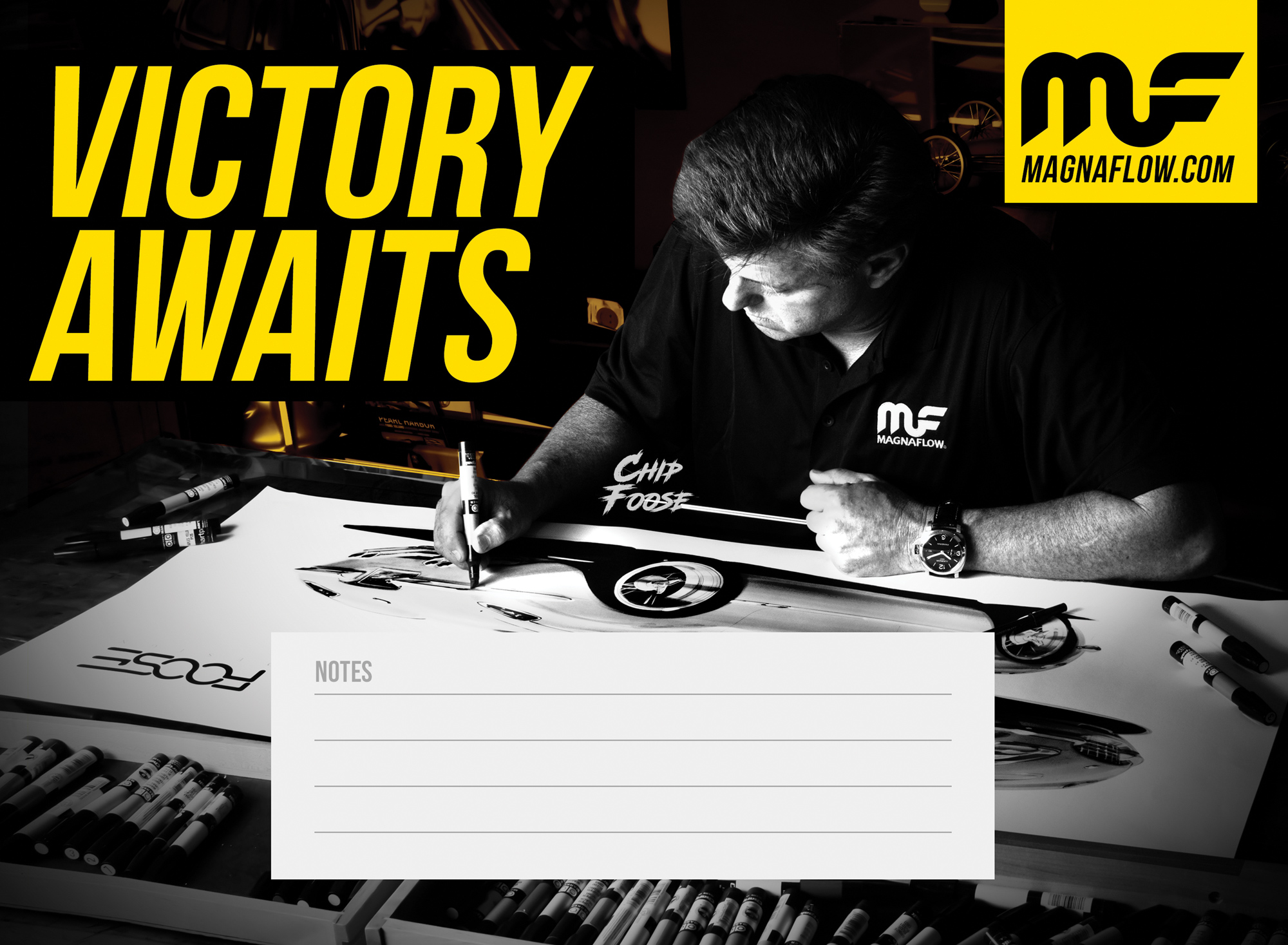
MAGNAFLOW BRAND BROCHURE

Following the success of the “Gold Blooded” campaign - originally launched at the SEMA trade show - MagnaFlow adopted the campaign’s bold visual language as a core expression of its brand identity. Rooted in the brand’s iconic gold color, the campaign positioned MagnaFlow as a symbol of performance excellence, passion, and leadership in the automotive industry. “Gold” represented being the best, while “blooded” spoke to the loyal, high-octane spirit shared by the brand’s ambassadors, employees, and customers.

Building on that momentum, I was brought on to design MagnaFlow’s official brand brochure using the same tone, visual style, and storytelling. The brochure was developed as a key marketing piece to be handed out at automotive events and shows, as well as distributed nationwide to retailers and authorized dealers. It served not only as a showcase of MagnaFlow’s product line and values but also as a brand statement - elevating awareness and reinforcing the company’s status as a leader in performance exhaust.

The design featured dynamic photography, clean layouts, bold headlines, and a refined gold-accented color palette - maintaining consistency with the “Gold Blooded” aesthetic while ensuring clarity and impact across every page. The brochures were widely distributed and well received, contributing to a measurable boost in product interest, customer engagement, and ultimately, an increase in sales across multiple retail and distributor channels.

Tap any image to view it larger.